D-A-CN-I-N-G T-I-M-E
Created on: December 2nd, 2007
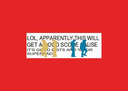
D-A-CN-I-N-G T-I-M-E
based on steakmans really funny sites from the intro of napolenon dynamits

Sponsorships:

Vote metrics:

rating total votes favorites comments
(3.46) 94 3 49

View metrics:

today yesterday this week this month all time
1 0 1 0 3,163

Inbound links:

views url
46 https://www.bing.com
4 http://216.18.188.175:80
3 http://www.google.com.hk
2 http://www.omgpop.com/
1 https://google.com

Add a comment

Please login or register to comment.
December 2nd, 2007
(-6)
[ comment (and 3 replies) is below rating threshold and has been hidden ]
(-6)
usually when people make good sites, other people like it.
December 2nd, 2007
(3)
Like some sort of warped Bond intro...
December 2nd, 2007
(2)
with dudes instead of chics
December 2nd, 2007
(0)
[ comment (and 2 replies) is below rating threshold and has been hidden ]
(0)
awesome photoshop let me give you a 5
December 2nd, 2007
(-4)
[ comment is below rating threshold and has been hidden ]
(-4)
you ruined a good Justice song...1'd
December 2nd, 2007
(-2)
[ comment is below rating threshold and has been hidden ]
(-2)
F - A - I - RL - Y - G - O - O - D ---
December 2nd, 2007
(-5)
[ comment is below rating threshold and has been hidden ]
(-5)
this site is REALLY bad. INCREDIBLY bad. uh... EXTREMELY bad.
December 2nd, 2007
(0)
http://tutorial.gov/learning_ytmnds
December 2nd, 2007
(3)
it really helps
December 2nd, 2007
(0)
+5 for comment answer
December 2nd, 2007
(0)
lol, needs better loopage
December 2nd, 2007
(0)
SuPah G0oD LL1ool!
December 2nd, 2007
(0)
O-K
December 2nd, 2007
(-2)
Lulz is a corruption of Lol, or Laugh out loud.
December 2nd, 2007
(0)
no.
December 2nd, 2007
(0)
oh hay
December 2nd, 2007
(0)
1'd for always being that annoying, extremely sarcastic kid
December 2nd, 2007
(0)
pwned
December 2nd, 2007
(0)
I think the reason that the original sites got good ratings was because the sound loop in the first site was flawless and fresh and the image in the second site took effort to make and looked pretty good.. This site has neither of those traits.
December 2nd, 2007
(0)
1) how did this image take any less effort? the only thing i didnt do was remove the credits. 2) he just looped a song, i at least did something to the song to make it somewhat original.
December 2nd, 2007
(-1)
1) I said, "the image in the second site took effort to make and looked pretty good.." Your image doesn't look like it is meant to look good. It's got the ugly wall of text in the background. The lulzspeak in your diss of steakman doesn't help either. 2) He added a beat in the second site to make the sound a little bit more original, and it made it sound worse. That happened to you, except you added a beat and sped up the whole thing to make it sound like an abomination.
December 2nd, 2007
(-1)
If you think that this site is good quality, then you have a warped idea of what "quality" is. Sure, the sound is more original. Sure, the image took effort. But you absolutely ruined the image by dissing steakman and you absolutely ruined the sound by speeding it up to an ugly level.
December 2nd, 2007
(-1)
If you want to get an example of good quality, go back to the time when you weren't featured and you spent time creating brilliant content and you didn't give a damn about other users or the politics on YTMND. KeatonWorld got corrupted by YTMND.
December 2nd, 2007
(-1)
The crux of the matter is that you're calling out Steakman for making crappy sites while, in the process, you've made a site that's worse than the ones that he's made.
December 2nd, 2007
(2)
i don't mind if steakman makes sh*tty sites. the sites that feel the crappiest are usually the funniest ones. i just don't like when sites are overrated. this site certainly took just as much effort as steakman's. all either of us did was take out the solid colors and replace them with other stuff.
December 2nd, 2007
(-1)
All I'm saying is that he replaced the background with something eye-catching and colorful. You replaced it with something stark, black and white, sarcastic, and ugly. That's the fundamental difference here: it is not our effort that matters, but what we do with that effort.
December 2nd, 2007
(3)
i spent like 4 hours on that site *ssh*le
December 2nd, 2007
(3)
well i thought mine was a hell of a lot more funny than steakman's
December 2nd, 2007
(2)
THIS IS GOOD SITE
December 2nd, 2007
(0)
hey umfold, i bet you can't find my other alt.
December 2nd, 2007
(0)
I don't even think steakman was trying to be particularly funny.
December 2nd, 2007
(0)
Why does Umfuld bother talking? He makes youtube rips or "classic" ripoff sites and wants to talk about being a view whore? I regret every second ever spent watching an Umfuld site, and he keeps making the tripe.
December 3rd, 2007
(0)
Yeah, the Recently Created is not on the front page. I forgot. And, no, your images may not be from youtube, but as I have said multiple times it doesn't matter where it comes from, as long as it is indistinguishable from something put on youtube (ie a straight rip) then it's a good trope for "tripe".
December 2nd, 2007
(1)
We're daanciiing, whooooaaaaaa! We're goooovin'! Jumpin' alooooong!
December 2nd, 2007
(2)
I bet steakman and keaton are one and the same.
December 3rd, 2007
(0)
funny, but how totally lame could one persons life be that he fights... with himself... over the internet.... on ytmnd?
December 2nd, 2007
(-3)
What the hell was this
December 2nd, 2007
(0)
WOW! GOOD EDITS AND SUPERBAD! 5!
December 2nd, 2007
(1)
epic domain grab.
December 2nd, 2007
(0)
Justice is the best thing to come out of France since Daft Punk, SebastiAn, Kavinsky, I can go on...
December 3rd, 2007
(-1)
lol superbad sucks lololololol
December 4th, 2007
(0)
I gives it a fives for superbads and goods edits.
January 4th, 2008
(0)
i was going to use that site url damn you
March 21st, 2008
(0)
Keaton make a longer version of this for wins