Johnny Cash for NES
Created on: October 8th, 2006
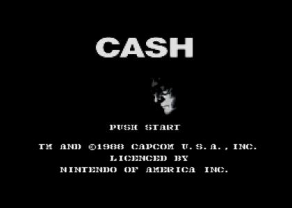
Johnny Cash for NES
None ( ._.)

Sponsorships:

Vote metrics:

rating total votes favorites comments
(3.88) 84 7 21

View metrics:

today yesterday this week this month all time
0 0 0 0 5,713

Inbound links:

views url
52 https://www.bing.com
7 http://www.google.com.hk
2 https://www.google.com/
1 http://wiki.ytmnsfw.com/NES/collection
1 http://changefulness.best/

Add a comment

Please login or register to comment.
October 8th, 2006
(0)
site sound?
October 8th, 2006
(0)
Close...you mispelled licensed.
October 8th, 2006
(0)
Great, =D
October 8th, 2006
(0)
LICENCED reminds me of Engrish
October 8th, 2006
(0)
is that "walk the line" in glorious 8-bit MIDI mode? worst gameplay ever; though jonny could only play as many chords as the NES has buttons...
October 8th, 2006
(0)
Oh yeah, the NES has less greys too, but that doesn't mean I'll lower your rating or anything, if you or anyone else would like the NES palette in Paint Shop Pro format, ask me, as I made one myself and only used it once :( so I'd like for it to be used.
October 8th, 2006
(0)
Actually...it wasn't his error. The original game mispelled it too. +1 for you, -1 for Capcom.
October 8th, 2006
(0)
5'd because the (C) Capcom 1988 made me LMAO.
October 8th, 2006
(0)
nice job
October 8th, 2006
(0)
I shot a man in reno, just to see him die.
October 8th, 2006
(1)
It's just too bad that Mr. Cash forgot to hit Continue....
October 8th, 2006
(0)
^ watch him die, dude. Nice work.
October 8th, 2006
(0)
:)
October 8th, 2006
(0)
SO cool.
October 8th, 2006
(0)
Folsom Prison FTW!!
October 8th, 2006
(0)
Shows how pitch can mean so little in music. But that was part of the joke.
October 8th, 2006
(0)
Nice Sound!
(0)
I tried to hit the start button.
December 11th, 2006
(0)
One graphic bug. Why face one tile have 5 color of 4? Rest be ok.
January 28th, 2007
(0)
The melody actually sounds better than the original Folsom Prison one! Great work here! :)
February 3rd, 2007
(0)
this would be such a kick-ass game