YTMND Conference 1945
Created on: October 21st, 2005
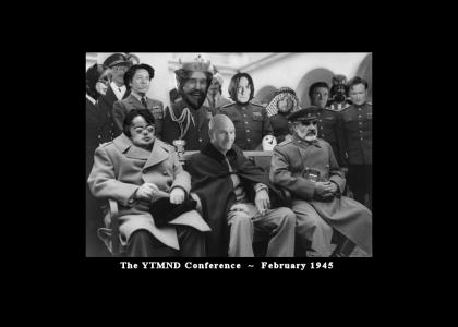
YTMND Conference 1945
The Big Three meet at YTMND in February 1945. Sorry about the non-appearance of the 150k update. Thanks for everyone's support!

Sponsorships:

Vote metrics:

rating total votes favorites comments
(4.24) 2,076 106 550

View metrics:

today yesterday this week this month all time
9 4 8 5 198,933

Inbound links:

views url
60 https://www.google.com/
38 https://www.bing.com
21 http://aksonural.ru/
11 https://www.facebook.com/
11 http://boards.4chan.org/v/res/55862640

Add a comment

Please login or register to comment.
<< 1 2 3 >>
October 21st, 2005
(0)
Awesome.
October 22nd, 2005
(0)
I knew my history books are school needed updating!
October 23rd, 2005
(1)
Excellent! BEST. YTMND. EVER.
October 23rd, 2005
(0)
YTMND makes history fun!
October 23rd, 2005
(0)
You win.
October 23rd, 2005
(0)
i logged on to 5 this
October 23rd, 2005
(0)
Nice use of Battlefield 1942 music.
October 23rd, 2005
(0)
+5 for music +5 for picture
October 23rd, 2005
(0)
Music alone gives a 5/5
October 23rd, 2005
(0)
The only bad photoshop is B.P., but I can forgive you for that. -1 for domokun, though
October 23rd, 2005
(0)
Well done. 5.
October 23rd, 2005
(0)
Make dschinghis khan a little more noticable, touche on the blending with him though.
October 23rd, 2005
(0)
5 for yalta
October 23rd, 2005
(0)
I see what you did there.
October 23rd, 2005
(0)
Some leet photoshopping there. I like how the Russian disco guy is worked into the background. (can't remember his name)
October 23rd, 2005
(0)
I see no n*gg*, or Mac. I suppose I should be glad for that or something.
October 23rd, 2005
(0)
5 for BF Music. Awesome picture too.
October 23rd, 2005
(0)
5 for the subtle Domo-kun, O RLY owl and Prince.
October 23rd, 2005
(0)
i love that track
October 23rd, 2005
(0)
Holy sh*t, I logged on to 5 this, AND I set it as my wallpaper.
October 23rd, 2005
(0)
Connery fits in so well
October 23rd, 2005
(0)
bf1942 for teh pwn
October 23rd, 2005
(0)
5/5 for connery carrying domokun
October 23rd, 2005
(0)
Incredible; needs n*gg* though.
October 23rd, 2005
(0)
Awesome. 5'd
October 23rd, 2005
(0)
i love that song, you win sir.
October 23rd, 2005
(0)
Instant 5 for Katamari
October 23rd, 2005
(0)
5 for teh battlefield music.
October 23rd, 2005
(0)
Nice Photoshop skills, most of them look natural.
October 23rd, 2005
(0)
The best YTMND I've ever seen!
October 23rd, 2005
(0)
So does that make Sean Connery a Communist?
October 23rd, 2005
(0)
As funny as a flashing secret forest reference would be, this site is perfect the way it is!
October 23rd, 2005
(0)
Kaga's face is perfect.
October 23rd, 2005
(0)
This is 5'd for the clean chopping
October 23rd, 2005
(0)
Somehow the look Picard is giving me seems creepier than Peppers' o_O
October 23rd, 2005
(0)
Thanks all of you for your feedback! I'm probably going to redo some of the heads... Picard is way to fuzzy around the edges. I'm trying to work in more characters, but I'm worried if I put in more it will look TOO crowded. Your comments are always app
October 23rd, 2005
(0)
Good 1
October 23rd, 2005
(0)
5+ for the image and 5+ for the sound (GREAT idea), *sidenote* i would have had the moscow guy the part of big three, but that's me :P
October 23rd, 2005
(0)
5
October 23rd, 2005
(0)
brian peppers is not nearly funny enough to be in the front row. milton should have been there. 5 if you fix it.
October 23rd, 2005
(0)
milton should be in place of peppers but 5 anyway
October 23rd, 2005
(0)
^^ SupaJSilver2, krieg748: My thought exactly. Problem is I couldn't fina a high-rez enough pic of Milton. I'm thinking I might take a screencap straight from the DVD and fix it, but I do kinda like Milton in the sailor hat.
October 23rd, 2005
(0)
perfection
October 23rd, 2005
(0)
awesome photoshopping
October 23rd, 2005
(0)
5 because Peppers is hilariment in that oversized coat.
October 23rd, 2005
(0)
Heh, Brian Peppers has a shrunken head.
October 23rd, 2005
(0)
I have the sudden urge to play bf1942
October 23rd, 2005
(0)
Snape, Iron Chef, and Connery all show awesome photoshop skillz. Yes, that's a Z at the end of skill. You're that cool.
October 23rd, 2005
(0)
Bravo, good sir. Bravo.
October 23rd, 2005
(0)
5'd for awesome image and music, but Peppers shouldn't be in the front
October 23rd, 2005
(0)
OH MY GOD!!ONE1 5,000,000 / 5. Everything about it is... great! It all makes sense now. Dschingis in the back row- Iron Chef- the King- it's all perfect. FYAD = nice touch.
October 23rd, 2005
(0)
left out hootie and tcbcr
October 23rd, 2005
(0)
wheres leroy jenkins as portrayed by martin lawrence :(
October 23rd, 2005
(0)
Since you're still considering updates... I wouldn't put Sonic in, as you said it would crowd it and not look natural (same with Mac). If you could work in Conan, somewhere, that would be a huge plus- perhaps put Conan in a uniform in front of Vader's
October 23rd, 2005
(0)
...armor, so the armor doesn't stand out as much? Beyond that, it's still perfect. You'll never please everyone, so I'd advise you just do your best- and from what I see here, you're quite good at doing so.
October 23rd, 2005
(0)
October 23rd, 2005
(0)
YOU WIN! GOOD DAY SIR!
October 23rd, 2005
(0)
Looks like vader has a boner.
October 23rd, 2005
(0)
Connery as Stalin? Glorious.
October 23rd, 2005
(0)
^^ Wankmaster: LOL you're right! I need to cover that up ASAP. I might take Lima's advice and stick Conan in front of Vader. I had him in the back row but it didn't look right.
October 23rd, 2005
(0)
Brian Peppers ate Winston Churchill.
October 23rd, 2005
(0)
AWESOMAZING
October 23rd, 2005
(0)
This deserves every 5 on earth, but it's missing Conan.
October 23rd, 2005
(0)
I disagree... I don't like Batman ualaewhatever, but he looks funny here. Conan to the right in front of Vader wins. The YTMND is already perfect anyway.
October 23rd, 2005
(0)
Maybe it's firefox or it's my computer but the music dousnt loop well.
October 23rd, 2005
(0)
BF1942 music for the f*cking win.
October 23rd, 2005
(0)
Okay fools, updated. Added Conan, hid the Vader Wang, and made Picard less blurry. I'm still not happy with Brian Peppers's head, but for now it's good enough. Overall I like it, I hope you do too.
October 23rd, 2005
(0)
Iron Chef Guy looks so dignified and self-important. 5!
October 23rd, 2005
(0)
switch peppers and conan
October 23rd, 2005
(0)
ASIACOPTER? WHERE?
October 23rd, 2005
(0)
Funny, creative, well thought out. My first log in and of course its a 5.
October 23rd, 2005
(0)
extreme dunting
October 23rd, 2005
(0)
This is great. I don't think I saw any of the "What is love?" guys in there though. At least one of them should make an appearance in a summit of this magnitude.
October 23rd, 2005
(0)
Wow, I didnt realize how much Sean Connery looks like Stalin, 4/5 because the Brian Peppers need need enlarging
October 23rd, 2005
(0)
So what got "updated"?
October 23rd, 2005
(0)
This is dramatic
October 23rd, 2005
(0)
You my good sir pwn at photoshop
October 23rd, 2005
(0)
Almost flawless, I love how the O RLY owl, the Prince, and a Domo-Kun are hiding in it. Moskau guy is in the back too. I wouldn't mind seeing Ugoff in this YTMND instead of Batman, but otherwise it's great. (Gay fuel reference would be cool too.
October 23rd, 2005
(0)
And as much as I like Brian pepper's tiny head on that huge body like Fatman from MGS2, Khaaaaan or Milton would work better for a Big Three.
October 24th, 2005
(0)
Thanks for employing my Conan suggestion- again, this is in my top 5 favorite all time YTMND's, and better than Cheers.
October 24th, 2005
(0)
That music rocks!
October 24th, 2005
(0)
The damn King's head is too big, he's hiding DK!
October 24th, 2005
(0)
There will be one more update to this, probably later this week. Of course, by them this YTMND will already be "teh OLD!!!1" I'm going to try and squeeze in more characters, but no promises that I'll get them all.
October 24th, 2005
(0)
In fact, I'm working on another YTMND idea that will allow me to include (nearly) every YTMND character in existence... wait and see kekeke
October 24th, 2005
(0)
^^ oniunit: Actually, Peppers's head is TOO big for that body. Check out the original picture (Google "Yalta") Churchill's head is TINY.
October 24th, 2005
(0)
We need to get this site to #1.
October 24th, 2005
(0)
I thought it was pretty good, and then I saw O RLY hiding behind Connery and I was in love.
October 24th, 2005
(0)
5 for not seeing The Prince at first. 5 for BF1942 music.
October 24th, 2005
(0)
Here's the original Yalta conference picture. http://www2.hj.se/hlk/kurser/multimedia2003/documents/Yalta.jpg When you look at it, Pepper's head is actually accurately sized. Something else you might want to consider is closing Snape's eyes to match t
October 24th, 2005
(0)
A+
October 24th, 2005
(0)
oh f*ck yeah +1 for aweosme idea +4 for battlefield music.
October 24th, 2005
(0)
f*ck the guy who downvoted this because of the O RLY owl. The owl totally wins this.
October 24th, 2005
(0)
This totally rocks. I always liked the pre-fight music from BF1942.
October 24th, 2005
(0)
Genius. Absolutely genius. 5'd. You are my favorite person alive.
October 24th, 2005
(0)
Fiyvhe. On this day, the world was changed forever...
October 24th, 2005
(0)
fuk fail.
October 24th, 2005
(0)
Brian Pppers is the reason I first came to this site..keep him in the front looking like a munchkin :D
October 24th, 2005
(0)
f*cking awesome!
October 24th, 2005
(0)
nice job thar
October 24th, 2005
(0)
Top shoppage there.
October 24th, 2005
(0)
lmao @ Brian Peppers. Great job.
October 24th, 2005
(0)
+5 for the Battlefield 1942 music.
October 24th, 2005
(0)
bring milton closer to the front. He was the first fad on ytmnd.
October 24th, 2005
(0)
Good editing
October 24th, 2005
(0)
That's some of the best photoshopping I've ever seen..
October 24th, 2005
(0)
Pure GENIUS. 5/5
October 24th, 2005
(0)
Brian Peppers as Winston Churchill=Mega XD
October 24th, 2005
(0)
Yalta man now dog ! =3
October 24th, 2005
(0)
Add more and get it crowded, Winston Churchill Peppers! How dare you Sir!
October 24th, 2005
(0)
fabulous work, love it
October 24th, 2005
(0)
good photoshopping
October 24th, 2005
(0)
Best menu music EVAR. 5'd.
October 24th, 2005
(0)
Incredible, except some of the faces need to be softened more
October 24th, 2005
(0)
deserving of a 5, and deserving of front page. I salute you.
October 24th, 2005
(0)
Nice photoshopping work.
October 24th, 2005
(0)
Genius!!!
October 24th, 2005
(0)
5'd for BF music.
October 24th, 2005
(1)
Joy. Another "LOL I CAN PASTE YTMND CHARACTER FACES OVER OTHER PEOPLE'S FACES" type site.
October 24th, 2005
(0)
If I could get this high res, I would put it on a poster.
October 24th, 2005
(0)
lol thats a good idea monster party, ytmnd selling conference posters
October 24th, 2005
(0)
woahahaha classic
October 24th, 2005
(0)
Haha Vader and Dschingis are the best, but please, where's Ugoff? And Darius?
October 24th, 2005
(0)
Logged in to 5 this also. 1942 is teh awesome.
October 24th, 2005
(0)
Hey...where's Sonic and Doc? Still great ytmnd, especially that O RLY owl!
October 24th, 2005
(0)
Four because of THE OWL. Just look at it.
October 24th, 2005
(0)
A truly great YTMND.
October 24th, 2005
(0)
Peppers looks like a Hunchback. I think he should be a hunchback, though.
October 24th, 2005
(0)
Very nice. The bf1942 music fits well
October 24th, 2005
(0)
Nice job adding Conan.
October 24th, 2005
(0)
Nice. Lolz.
October 24th, 2005
(0)
Kaga makes this win.
October 24th, 2005
(0)
I love it. Good choice of music. But you should have made someone else Winston.
October 24th, 2005
(0)
connery as stalin = genius if you could sqeeze one or 2 more fads it'd be great
October 24th, 2005
(0)
This would be even better if there was Gay Fuel/PSP sticking out of someone's pocket
October 24th, 2005
(0)
screw gay fuel and PSP. we need a couple of more characters. Wicket The Ewok and quagmire
October 24th, 2005
(0)
brilliant
October 24th, 2005
(0)
well this should help me with my Modern World History exam Wednseday... 5d
October 24th, 2005
(0)
Wow. Many of those heads have been superbly photoshopped. Especially Connery and Conan...
October 24th, 2005
(0)
This YTMND wins so hard. Picture = 5/5. And the BF42 music = inifinity/5
October 24th, 2005
(0)
this is one of the best photoshop jobs I've seen on ytmnd
October 24th, 2005
(0)
Again, thanks for all the praise. I never expected this kind of support. You all rock so hard. Anyway, I plan one more update to include a couple more characters/objects. Expect it later this week kthx.
October 24th, 2005
(0)
f*ckING WIN!!
October 24th, 2005
(0)
well photoshopped sir
October 24th, 2005
(0)
Best Ytmnd ever.
October 24th, 2005
(0)
ROFLMAO Nice sneak in of Prince of the Cosmos, The ORLY Owl, and the FYAD Spam. Khan guy is nice PS btw.
October 24th, 2005
(0)
greatness
October 24th, 2005
(0)
5'd Nice Photoshop :D
October 24th, 2005
(0)
God damn this rules. Logged in the 5. Thank you.
October 24th, 2005
(0)
win
October 24th, 2005
(0)
Love the picture. I like the music but it could be better, personally I'd put in something a little more...well, loud and overly patriotic like the starship troopers theme. But don't get me wrong, I love it.
October 24th, 2005
(0)
You win.
October 24th, 2005
(0)
classic
October 24th, 2005
(0)
If you look at the original photo of the Yalta conference, the person in Peppers' place (Churchill) actually does have a small head. So that seems accurate enough to me.
October 24th, 2005
(0)
Brilliant.
October 24th, 2005
(0)
Oops, forgot to rate it. Oh, and it would be funnier to see Palpatine or Pope Benedict in the middle as Roosevelt, since they look alike. kek
October 24th, 2005
(0)
Notice how you dont see the retarded batman, does any one else get it? batman doesnt belong on ytmnd! 5 for not including batman
October 24th, 2005
(0)
Hey, Batman's to the left. YOU LOSE, GOOD DAY SIR (my favorite in the pic is the ORLY Owl. He looks so happy.)
October 24th, 2005
(0)
i love bf1942
October 24th, 2005
(0)
The best is Dschingis in the background!
October 24th, 2005
(0)
Brilliant.
October 24th, 2005
(0)
Amazing
October 24th, 2005
(0)
What the heck!? The Picture doesn't move!!1!11! Psyche. Nice ytmnd.
October 24th, 2005
(0)
you are teh winnar!
October 24th, 2005
(0)
No Hitler?
October 24th, 2005
(0)
5'ed for good photoshopping
October 24th, 2005
(0)
you might think i'd be getting tired of all these ytmnd nationalist type pages, but no. nice work.
October 24th, 2005
(0)
I love the music and the pic 5/5
October 24th, 2005
(0)
Haha, wow!
October 24th, 2005
(0)
BATTLEFIELD 1942!! HELL YEAH BABY 5!
October 24th, 2005
(0)
Really well done, man. I especially like Shatner, Conan, Snape and the Iron Chef; they almost look like they belong there.
October 24th, 2005
(0)
HAHAHAHAHAH THE BEST PART O RLY OWL
October 24th, 2005
(0)
o rly owl = 5
October 24th, 2005
(0)
Some nice Photoshoppin' you've done there; Snape and HASSSAAAAANNNN ALLYAHAYA need some work but... you get five!
October 24th, 2005
(0)
Everyone forgot Tom Cruise too quickly, if only he could have fit in there.
October 24th, 2005
(0)
For Potgeiter in the back, 5.
October 24th, 2005
(0)
I'm very impressed by how well done it is. 4/5
October 24th, 2005
(0)
I love that song! Nice Editing!
October 24th, 2005
(0)
Ahhh, BF music. Very nice.
October 24th, 2005
(0)
To those who think Peppers doesn't belong there: http://www.spartacus.schoolnet.co.uk/RUSyalta.JPG OWNED This YTMND = Perfect Historical Accuracy
October 24th, 2005
(0)
And now, the final blow: http://www.thenagain.info/WebChron//World/Yalta.jpg Demonstrates that this YTMND is not only historically accurate, but damn briiliant.
October 25th, 2005
(0)
i love it
October 25th, 2005
(0)
Nice work
October 25th, 2005
(0)
Epic
October 25th, 2005
(0)
I'd 5 it...but it's completely still. You would work in a lot more fads and characters if you used a few more pics and put them on a 5 second rotation. Even so, this gets 4.
October 25th, 2005
(0)
Wait, hold on. What I said earlier still applies, but 10/5 for DOMO CHAN!
October 25th, 2005
(0)
October 25th, 2005
(0)
You only get 4, because Batman is there. He is no fad, and the only site that he's in is an utter failure. Other than that, solid YTMND.
October 25th, 2005
(0)
Living legends.
October 25th, 2005
(0)
Five! great edit! nice +5! ummm yeah 5+!+!
October 25th, 2005
(0)
Nice edit, and bf1942 song rocks!
October 25th, 2005
(0)
Lima what do the original pictures have to do with Peepers? Photoshop quality has nothing to do with choice of characters.
October 25th, 2005
(0)
Brilliant
October 25th, 2005
(0)
It's so simple that at first you think is crap. Then you vote 5.
October 25th, 2005
(0)
http://www.historyplace.com/worldwar2/ww2-pix/yalta2.jpg for the original pic
October 25th, 2005
(0)
Where's Ugoff, anaway? He's more popular than that Burger king guy there.
October 25th, 2005
(0)
Awesome idea, photoshop, music choice. One of my personal favorite YTMNDs, good job.
October 25th, 2005
(0)
Haha that is awsome. Take a look at this http://mmfyad.ytmnd.com/
October 25th, 2005
(0)
Whoever downvotes this is a TRAITOR
October 25th, 2005
(0)
Missing Sonic and What Is Love. Still 5.
October 25th, 2005
(0)
+1203873 for song + 796127 for pic for a total of 2000000
October 25th, 2005
(0)
awesome!
October 25th, 2005
(0)
As a Poli Sci Major, I can ACTUALLY laugh at this. Brilliant.
October 25th, 2005
(0)
Kind of funny, excellent photoshop, but it's not very original.
October 25th, 2005
(0)
Anyone have a link to that song?
October 25th, 2005
(0)
the o rly owl=5
October 25th, 2005
(0)
Riptor - view source of page, nub
October 25th, 2005
(0)
Where's the NSMB? Ugoff? Sonic? Gay Fuel?
October 25th, 2005
(0)
omfg! f*ckin HELL YEAH!!! YOU ARE THE MAN!!! btw, i have bf1942 too. lol
October 25th, 2005
(0)
ROFLMAO ! didnt expect the o RLY owl to be in there :P
October 25th, 2005
(0)
perfect you did'nt mis one good fad.
October 25th, 2005
(0)
A-f*cking-mazing. As much as Batman looks way too far out of place, and the King's head seems a tad too big, the rest is perfect. Top3 are Takeshi, Conan and Snape, though the addition of Potgeiter is brilliant.
October 25th, 2005
(0)
4 for great photoshopping, 1 for BF1942 music, 1 for the little details (Katamari Prince, ORLY owl, etc.). That makes for 6 stars, the highest I've given any YTMND.
October 25th, 2005
(0)
lmao...good use of the BF1942 theme ! :O) 5/5
October 25th, 2005
(0)
THIS is something to be proud of. Ahahah. Somebody make this into a poster, PRONTO !
October 25th, 2005
(0)
These are the legend fabs, sonic, n*gg*, mac, and cloudsong are and always WILL be crap. the men on this picture are people to be proud of, lol.
October 25th, 2005
(0)
Note: DEATH TO DOWNVOTERS.
October 25th, 2005
(0)
it is missing just one person, Bill Cosby.
October 25th, 2005
(0)
While it would be nice to see all of the fads here, keep in mind animated heads wouldn't look right on the uniforms, and things get cluttered real fast. As far as the King's head being "too big," I say it's what makes the pic so hilarious and defina
October 25th, 2005
(0)
Wow! Excellent! It has: Dschinghis Khan... Picard... Vader... and even the ORLY? Owl! That's enough for me! Whoooo!!!
October 26th, 2005
(0)
OMG I couldn't stop laughing. The Battlefield 1942 music goes well wif it as well. finalfantasylord
October 26th, 2005
(0)
5 for BF1942
October 26th, 2005
(0)
4 because Peppers shouldn't be in the front. Put Shatner or the Moskau singer there instead.
October 26th, 2005
(0)
perfect, whoever says otherwise is stupid.
October 26th, 2005
(0)
Nicely done.
October 26th, 2005
(0)
only picard, sean connery and brian peppers could have defeated hitler :)
October 26th, 2005
(0)
Peppers head seems too small its not in proportion, But I love the site!
October 26th, 2005
(0)
I think you should change Batman and Peepers somehow, everything else is perfect.
October 26th, 2005
(0)
You guys do realize that in order to add Roxbury, he would have to remove two other fads? Not worth it.
October 26th, 2005
(0)
i think brian peppers shouldnt be a main leader, maybe switch him with the king or snape or someone. other than that it's AWESOME, its my desktop background
October 26th, 2005
(0)
4
October 26th, 2005
(0)
Well, we need to add Sonic somehow into the pic, but I don't think we should remove anyone else as all of the characters shown are major ytmnd characters. We might need to do something for Sonic similar to the O RLY owl, Prince of all Cosmos, and Domo-K
October 26th, 2005
(0)
Freaking amazing. Switch Milton and BPeps and this would be perfect.
October 26th, 2005
(0)
OMG I THOUGHT THIS WAS GOING SOMEWHERE...THEN IT DIDNT...BAH!
October 26th, 2005
(0)
Much love to the Photoshops of Conan, Kaga, Snape and Connery. Those four easily show the highest level of the time, effort and skill you put into this. And to the people griping about Peppers being in the front: Brian, Connery and Picard are thrown aroun
October 26th, 2005
(0)
d the most on YMTND. So Peppers belongs there.
October 26th, 2005
(0)
Ugoff. Needs Ugoff.
October 26th, 2005
(0)
Dude. The O'RLY poking his head over Connerys shoulder made me spit milk. I looked at this for 2 minutes before I noticed him. 1500 Quatludes for the newcomer.
October 26th, 2005
(0)
-3 for not including Sonic, Mario, and the Punchout black dude, and -1 for Batman, which leaves you with one. Of course, this will change, you have a chance.
October 26th, 2005
(0)
5 just for the expression on Kirk's face. He looks like he just smelled a nasty fart. Plus another 5 for the rest. Nice job.
October 26th, 2005
(0)
lol perfect
October 26th, 2005
(0)
lol, everybody is saying that brians peppers needs to be moved, i think we should vote on who we should replace him with
October 26th, 2005
(0)
The "updates" aren't really helping anything. Still funny as hell, though, and completely deserving of its 5 stars.
October 26th, 2005
(0)
This is all opinions he takes it or he leaves it, nothing to do with people's sexual preferences, grow up!
October 26th, 2005
(0)
You have to add the King of All Cosmos! That would own!
October 26th, 2005
(0)
For some reason, my vote isn't registering. I gave it a 5, though.
October 26th, 2005
(0)
I love the Owl peeking out. great stuff. 5'd, although I would love to see the punchout n*gg* in there sonewhere.
October 26th, 2005
(0)
also, the funniest thing in this is the facial expression of the Bell Peppers guy. brilliant.
October 26th, 2005
(0)
Fix/replace Peppers and it will be perfect.
October 26th, 2005
(0)
Great ytmnd. Not that you can please everyone but I would like to see FPS Doug in there somewhere. xD
October 26th, 2005
(0)
infinityDUCK, perhaps consider making the edges of the photo look "burned" and make the whole image sepia colored, so it looks like an old photograph. just a suggestion.
October 26th, 2005
(0)
Not animated, I hate it.
<< 1 2 3 >>