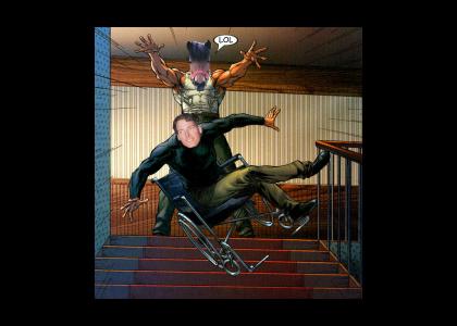
Christopher Reeve's One Weakness
Created on: August 24th, 2005

Hope you like it and I hope you hate it. Quality is supposed to look bad to add more effect.
None ( ._.)
Sponsorships:
| user | amount | user | amount |
|---|---|---|---|
| No one has sponsored this site ( ._.) | |||
| Sponsor this site! | Total: $0.00 | Active: $0.00 | |
Vote metrics:
| rating | total votes | favorites | comments |
|---|---|---|---|
| (3.65) | 23 | 0 | 4 |
View metrics:
| today | yesterday | this week | this month | all time |
|---|---|---|---|---|
| 0 | 1 | 1 | 1 | 5,112 |
Inbound links:
| views | url |
|---|---|
| 50 | https://www.bing.com |
| 6 | http://www.google.com.hk |
| 1 | http://www.google.com |
| 1 | http://216.18.188.175:80 |
| 1 | https://www.google.com.au |
Bold
Italic
Underline
Code
User Link
Site Link